Driveforce | packaging & More
Dielines & Graphics for a Sachet & POP box
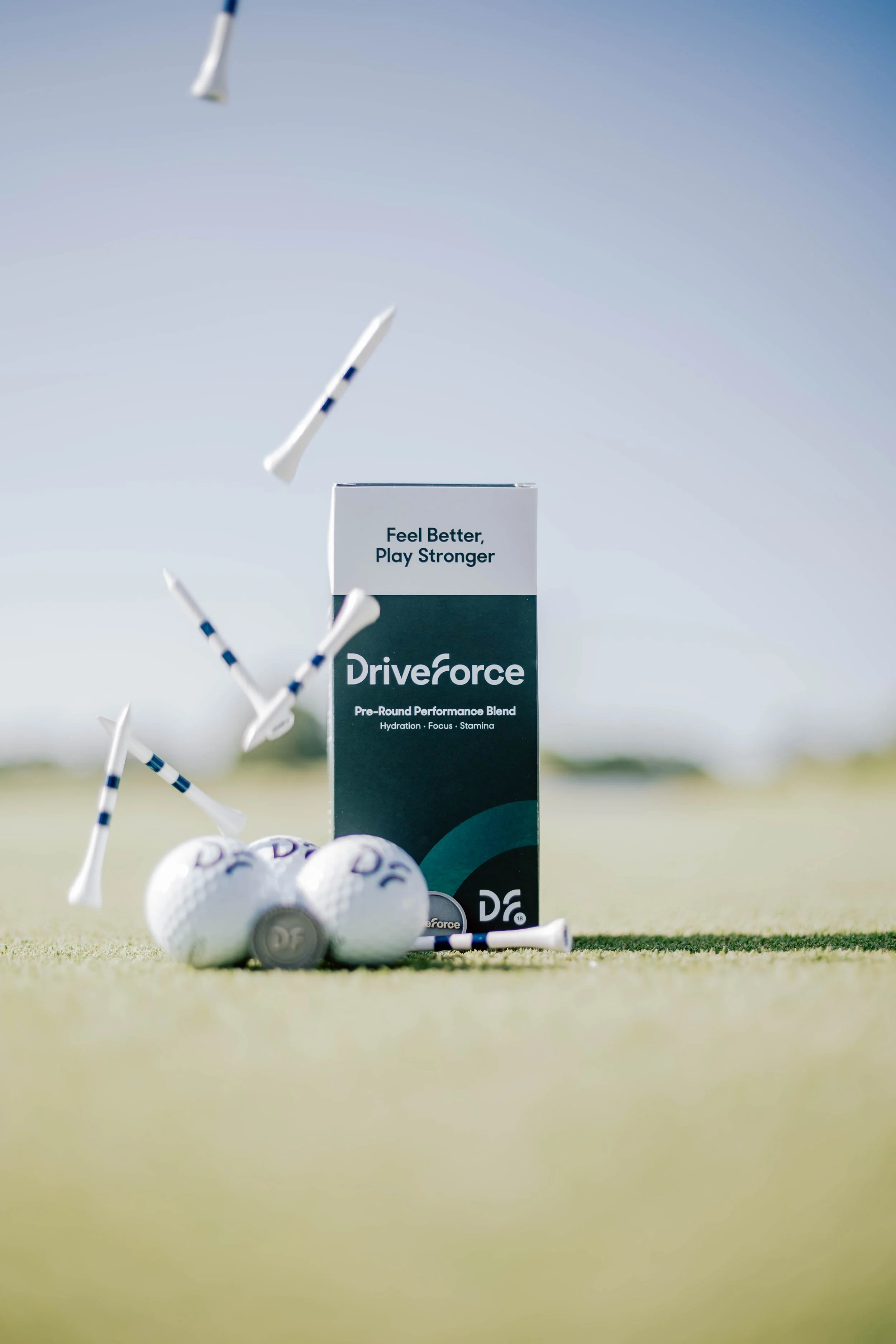
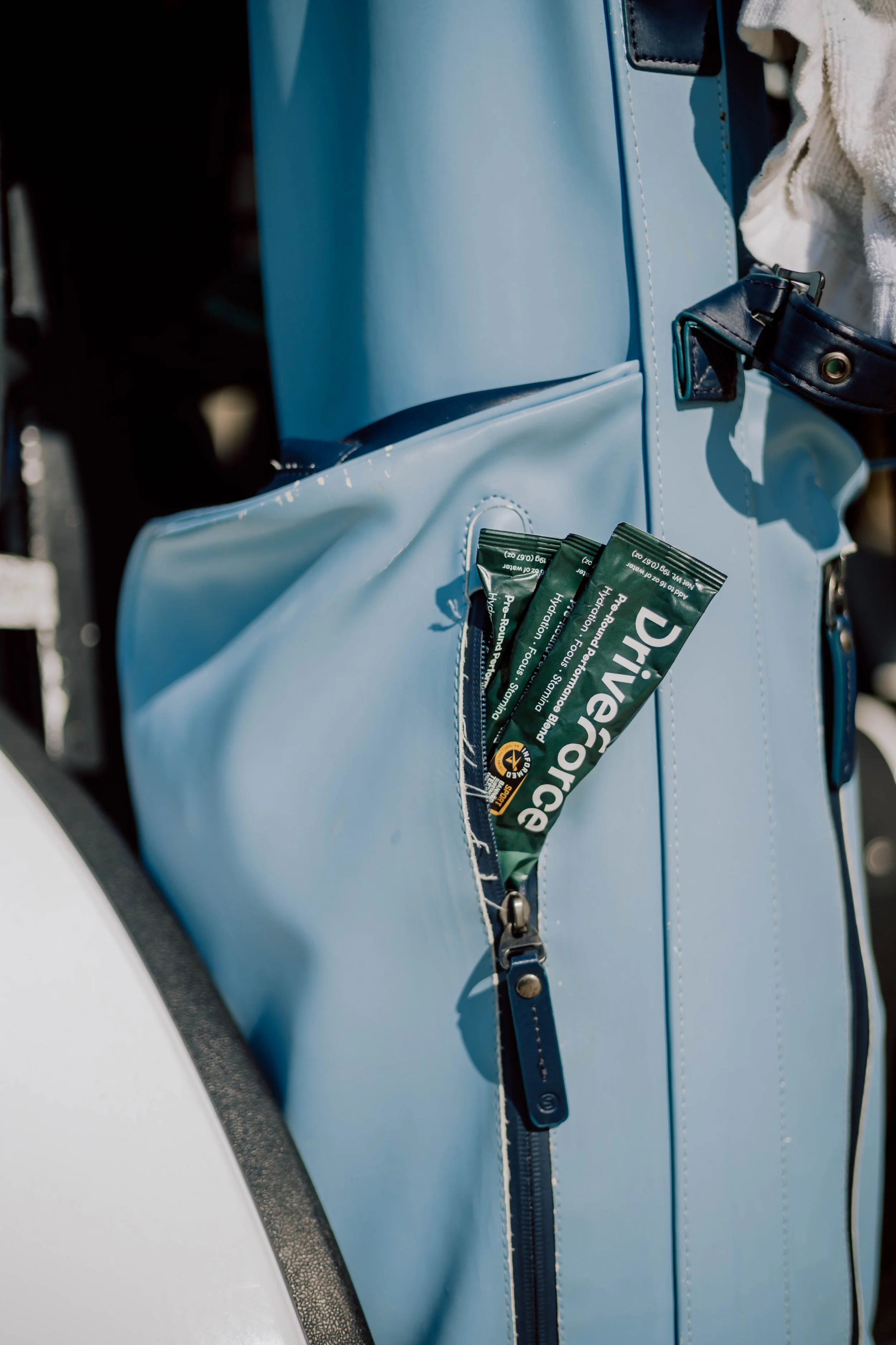
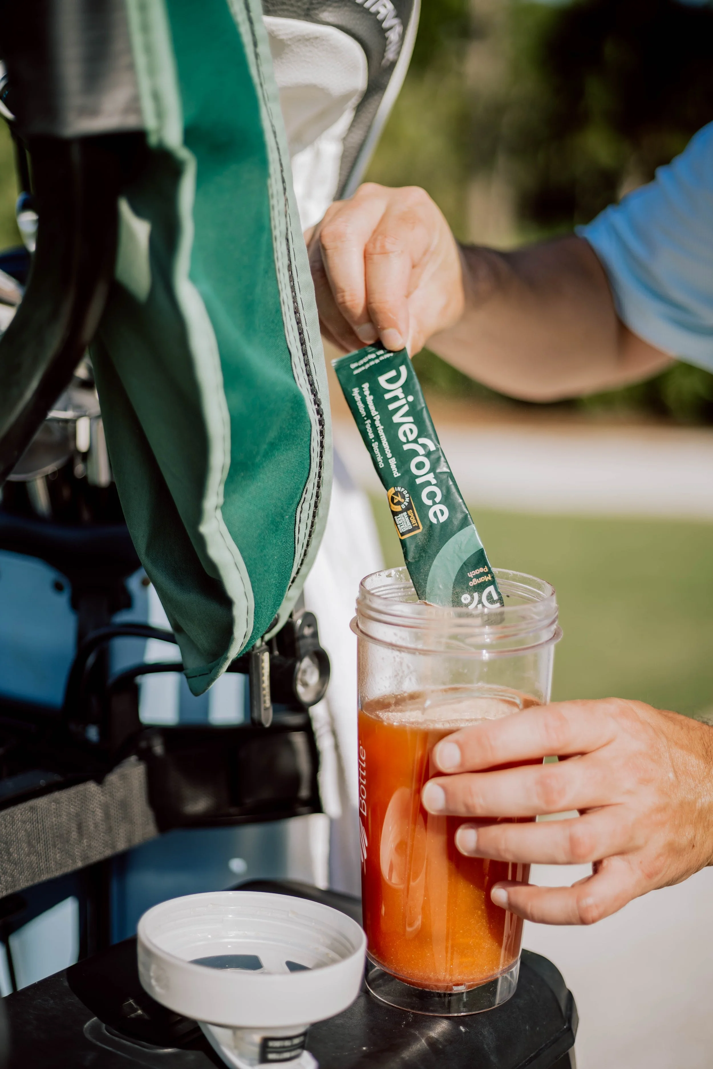
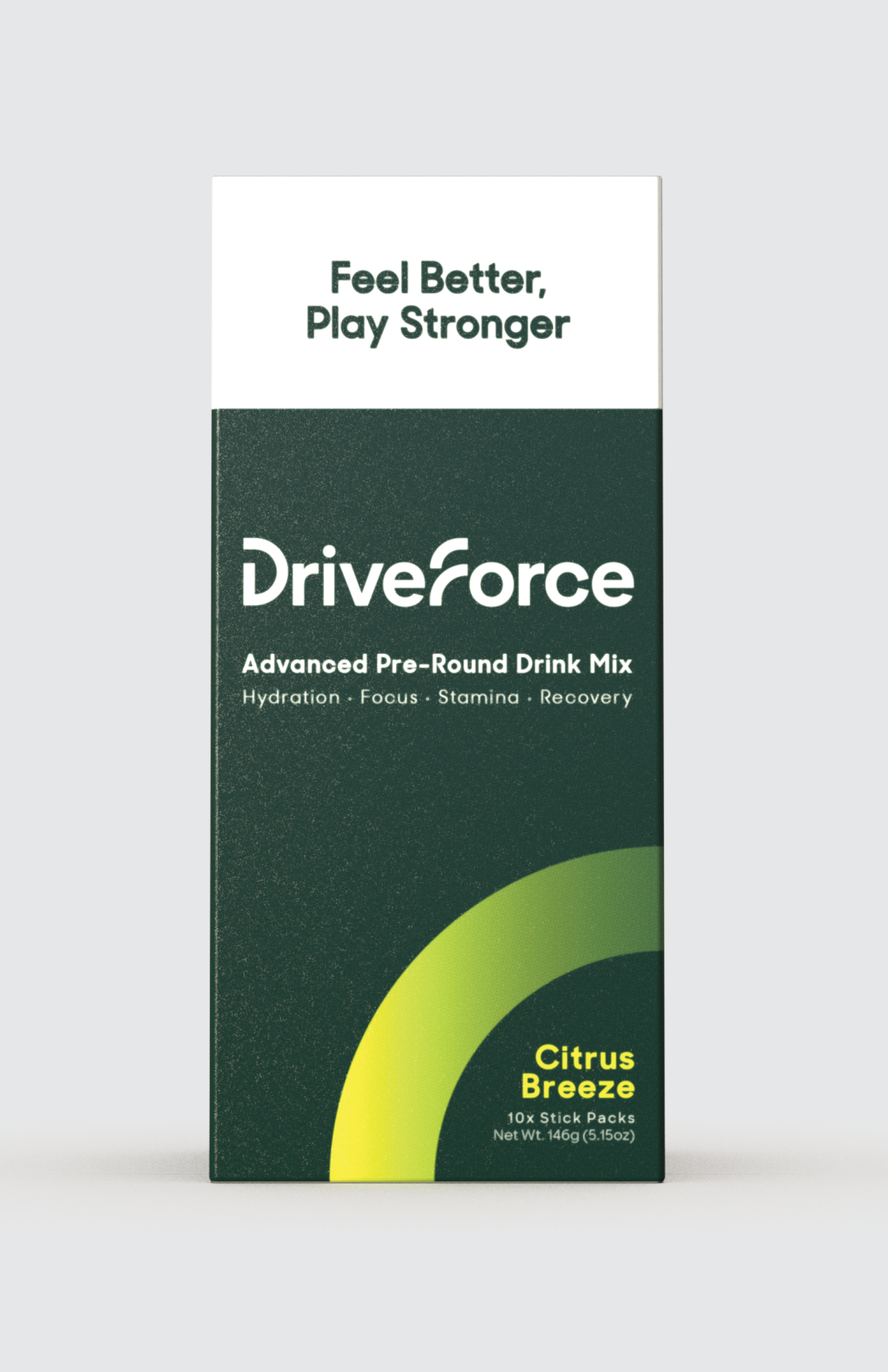
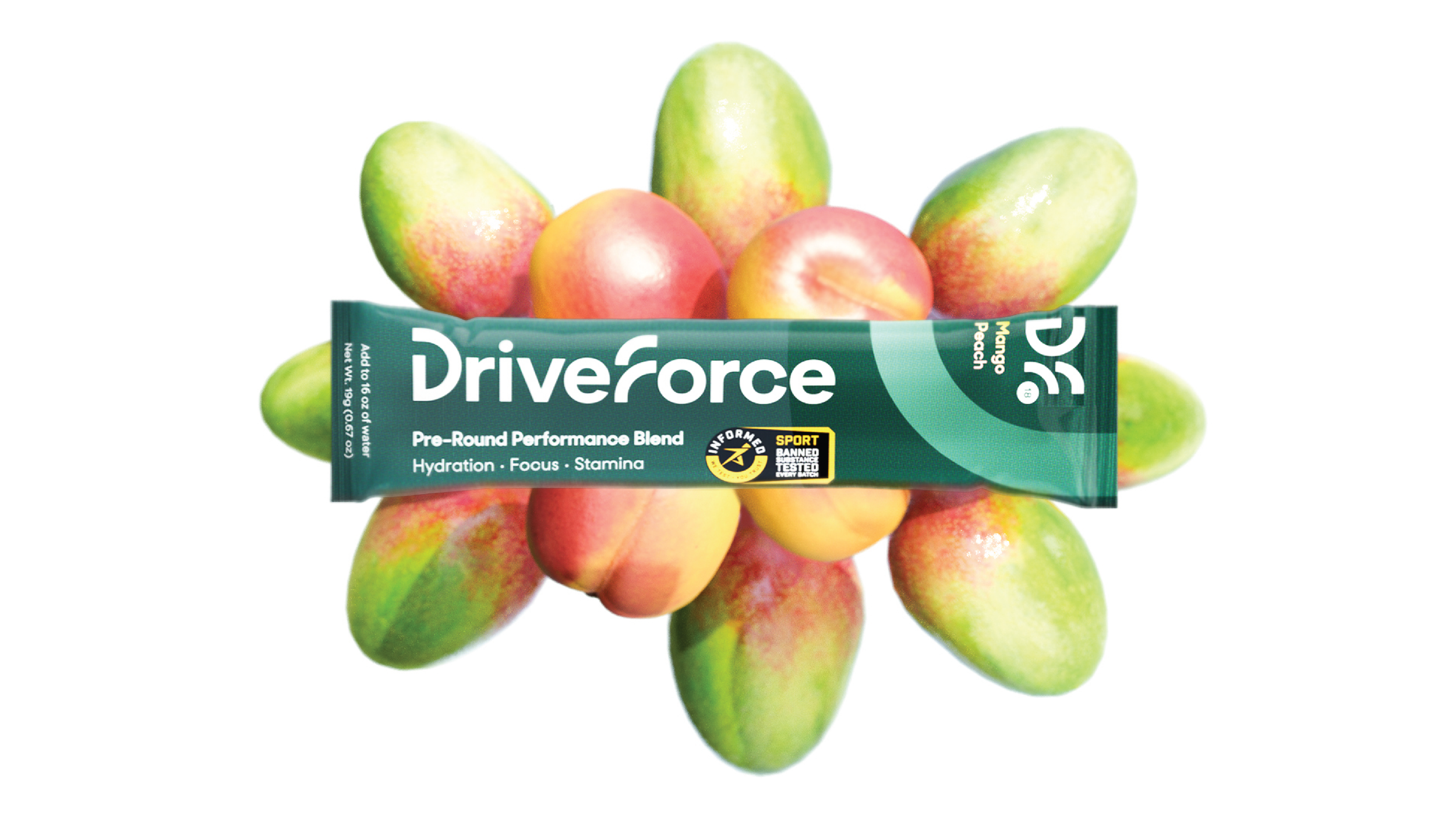
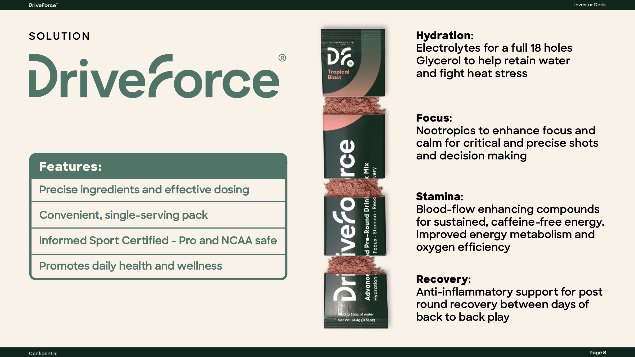
DriveForce is a powdered drink mix that improves hydration, focus, stamina, and recovery. Their niche is within the golf industry, targeting golfers and pro-shops. The packaging consists of a single-serving packet and a box containing 10 packets, sold in E-commerce and retail settings.
I’ve been doing freelance work for DriveForce for a few years. While this page focuses on packaging, I’ve also worked on their: visual identity, marketing collateral, sales assets, event materials, systematically used 3-D models, investor decks, and more.
Process
DriveForce originally went to a large design agency for branding and packaging design. The logos came out quite well. The packaging design, however, did not accomplish whit it needed to.
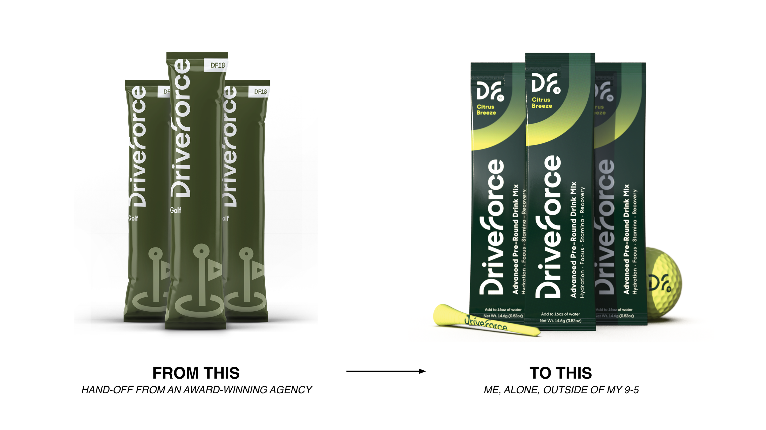
In an undefined state the client had many ideas and so did I. In this scenario, I find variety to be best, to fail fast and learn from it. Over the course of a month, I made a couple hundred drafts.
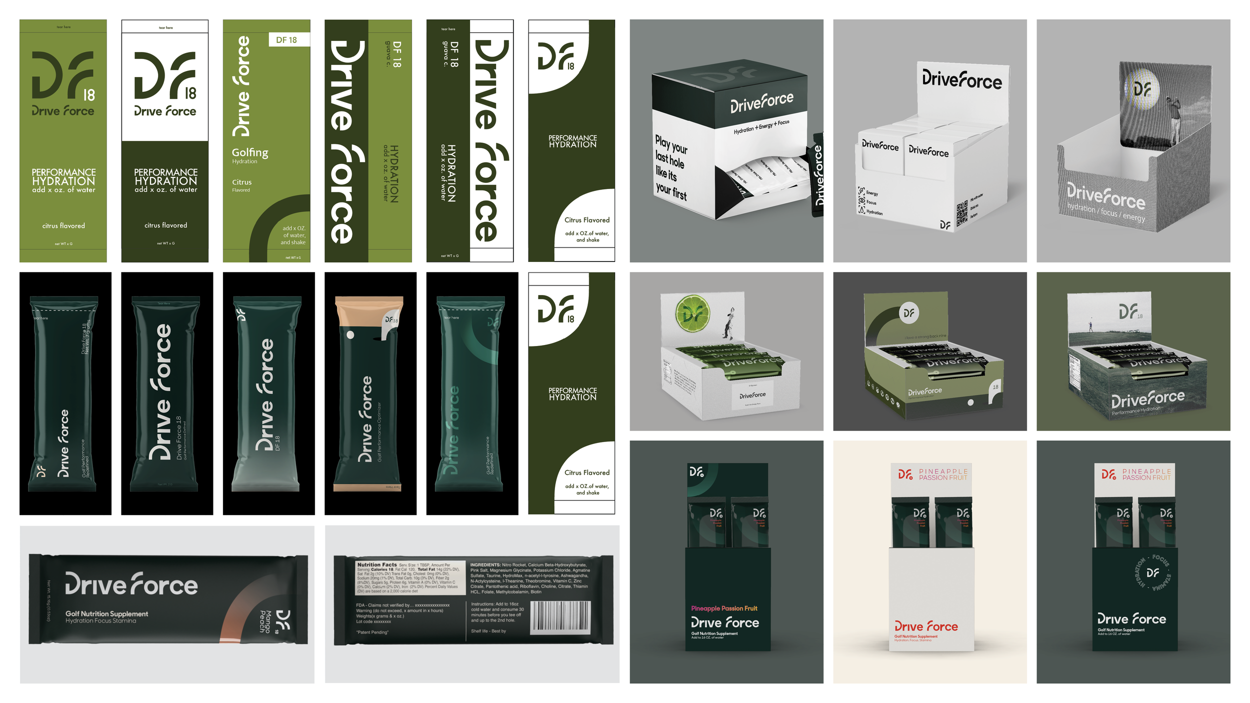
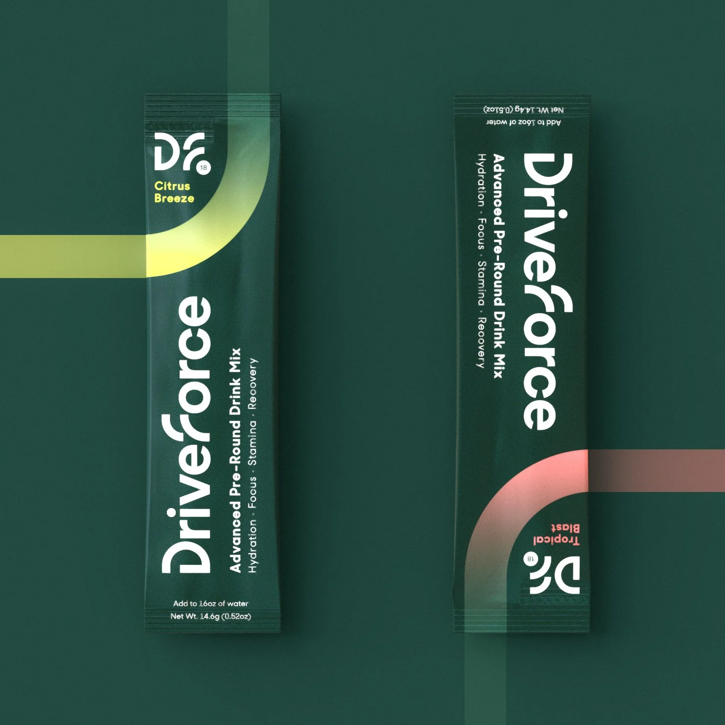
The sachets were the original packaging focus, but after learning that they would be sold in boxes for both e-commerce and retail scenarios I realized it best to design in parallel.
The sachets and boxes are graphically and structurally tied to one another.
A simple tear along a perforated line, and tucking on one flap converts the box into a retail POP display. In this state, the visible portion of the sachets includes the logomark and flavor.
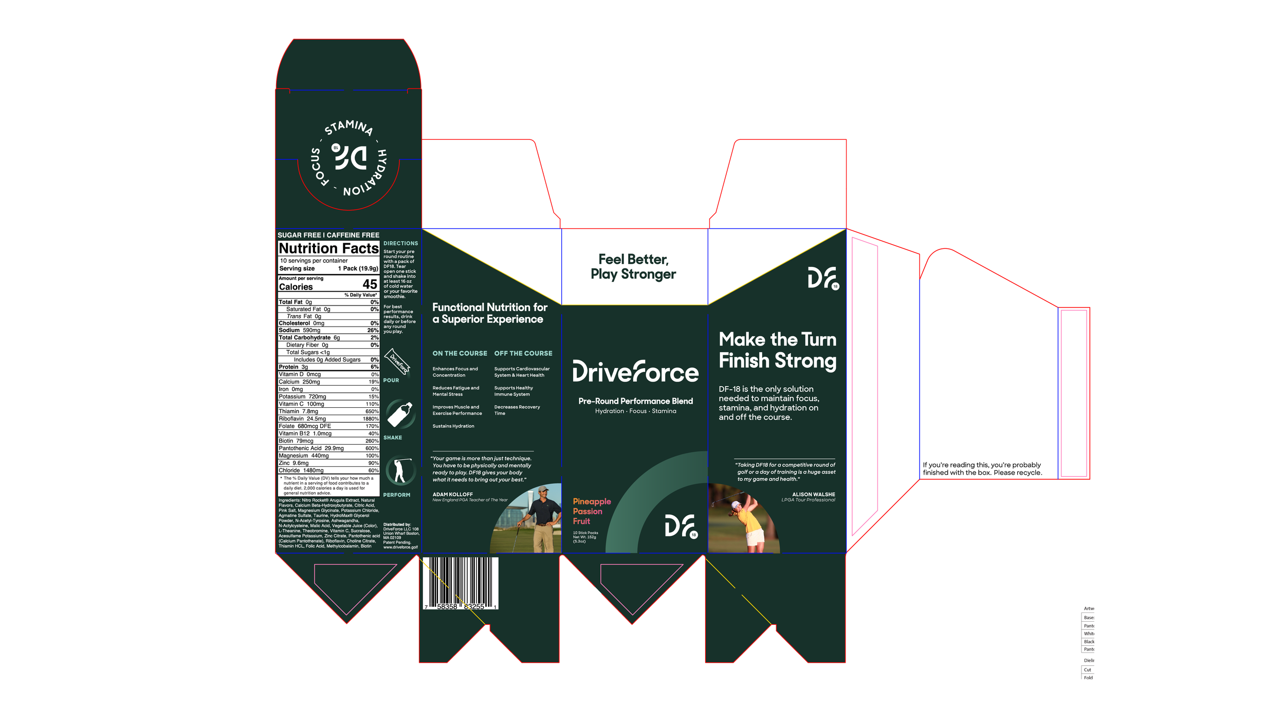
An “auto-locking” bottom feature is utilized, allowing for KD(flat) shipping for fast assembly. This was a lucrative decision as sachets and boxes came from different facilities, so the box was shipped and assembled at a co-manufacturing facility.
A divider that holds the sachets in place also provides a lock that the rear flap locks into, when in the display position.
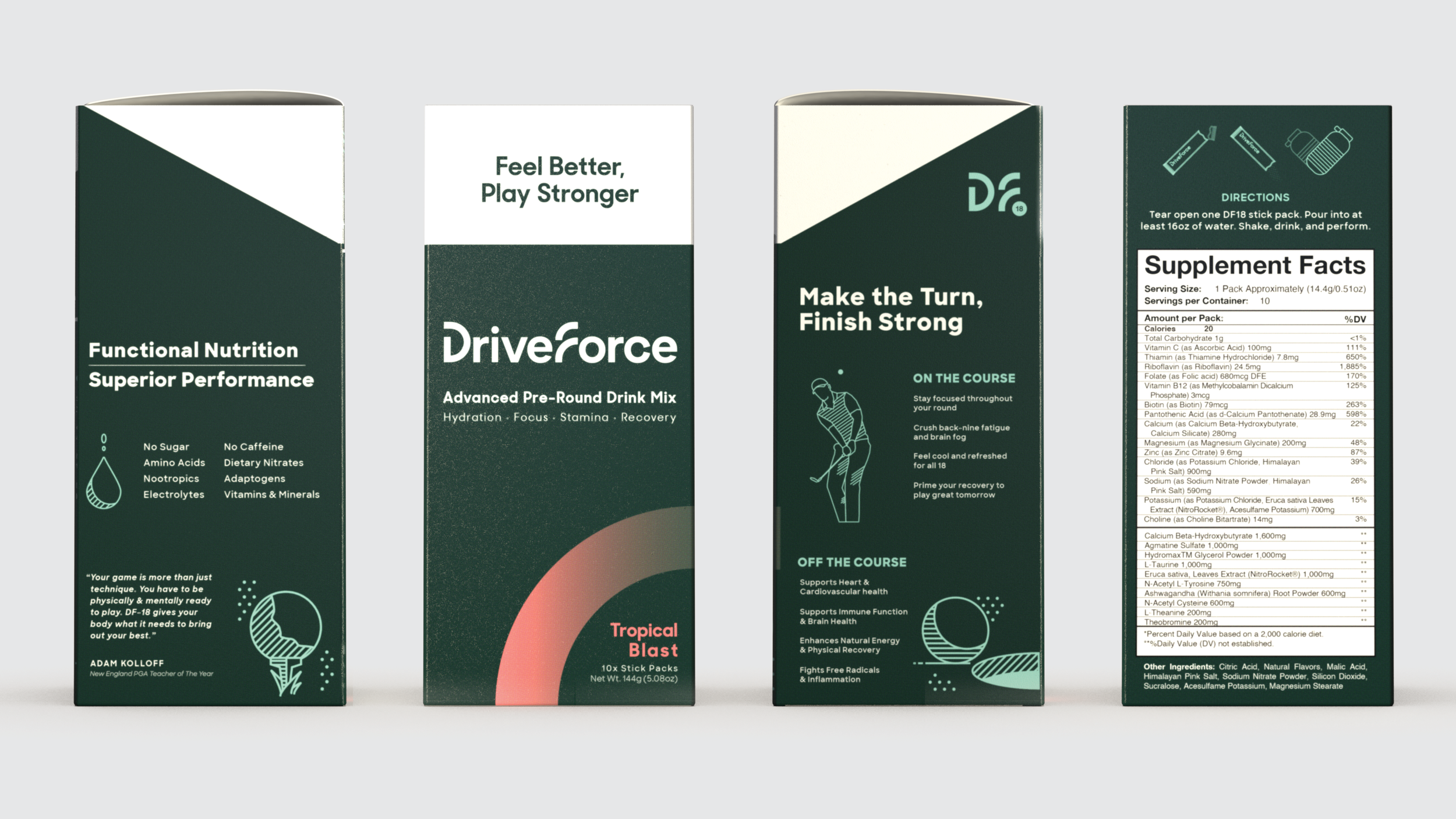
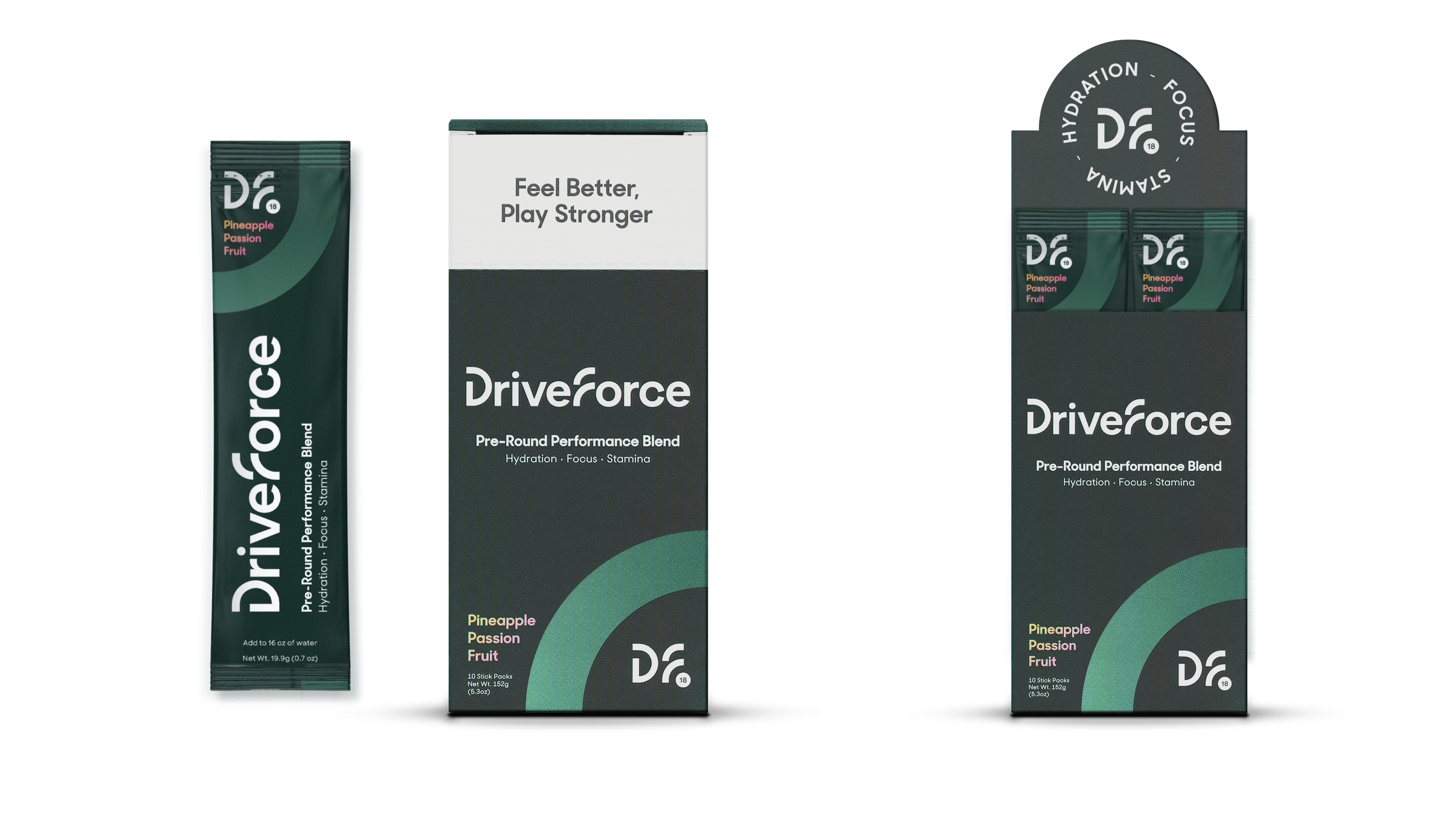
Current boxes
I did not make this video, but I did make the: 3-D model, graphics, and of course packaging featured.
A previous investor deck - click image or link to view
Keep exploring the site >